Monkeytronics is a New Zealand company that makes indoor air quality monitoring devices, tracking CO2, temperature, humidity and more across homes, schools and workplaces.


The app was live but still in beta: functional, but not built with the end user in mind.
It had to work across three very different environments, homes, schools and workplaces, each with its own priorities and comfort with technology, and it needed to turn complex sensor data into something anyone could check and act on in seconds.
The decision was to build one visual language and one way to read the data, no matter the device or environment, so moving from a single home to a school or workplace deployment would not add friction or slow down the rollout.
Success meant no added friction when scaling from a single home to a school or workplace deployment.
From a working beta to a real product
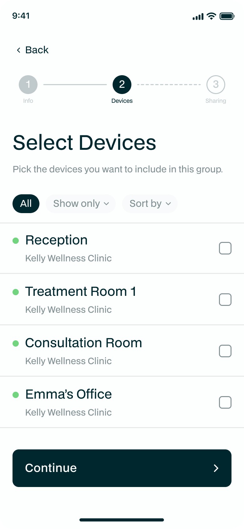
The redesign did more than simplify the data, it gave Monkeytronics an actual design system. What had been a functional beta, built with default components and no real visual identity, became one cohesive visual language: consistent color coding, clear iconography and the same layout logic applied across mobile and web.
That system is what let raw sensor readings turn into a color coded status anyone could read in seconds, but it also changed how the product felt overall.




Webapp Extension
As an extension of the project, Monkeytronics was later brought to the web, giving users the same experience on desktop or tablet, without changing what they already knew from the mobile app.