
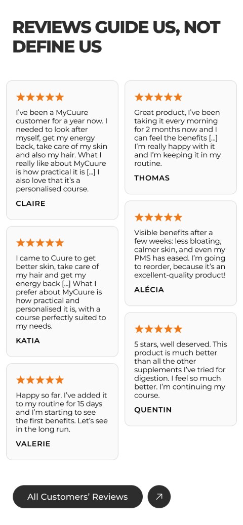
Trusted by 300,000+ customers, Cuure needed its website to finally look as credible as its clinical research, and this design system delivered that.


The existing site lacked a cohesive visual language.
Typography was flat, components were inconsistent across pages, and the experience didn't reflect the brand's scientific authority.
First-time visitors had no clear trust signal, and the product catalogue, despite having 100+ products, felt hard to navigate. The design needed to feel premium and science-led without becoming cold or clinical.
The new design system needed to establish a clear visual hierarchy that…
Communicates scientific rigor and human warmth in equal measure
Reduces conversion friction for first-time visitors
Delivers a scalable component library that any designer or developer on the team could apply consistently without needing to reinvent decisions
Scientific credibility, built into the system
The redesign translated Cuure's clinical positioning into a visual language: a typographic system that creates tension between precision and warmth, animated data visualizations that make proof points tangible, and glassmorphism used selectively to signal depth without sacrificing legibility.
The result is a design system that reflects what Cuure actually is, a science-led brand, not just a supplement shop with a premium aesthetic.






Related Projects